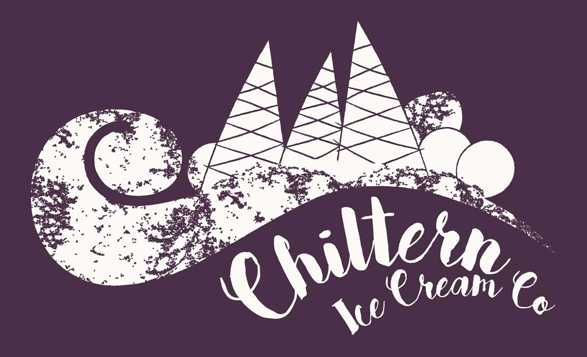
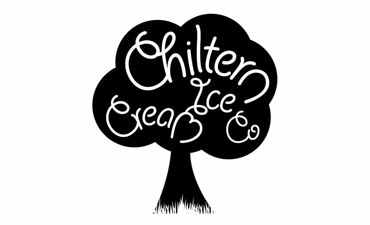
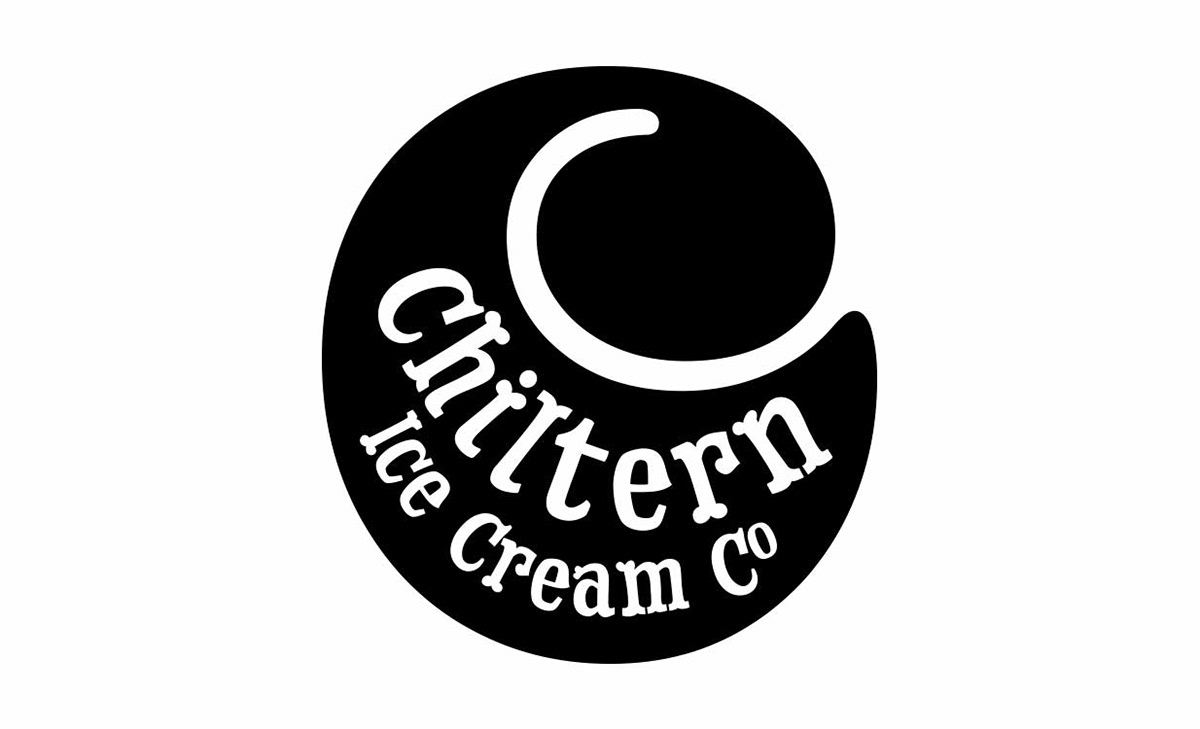
The Chiltern Ice Cream Company wanted a brand identity that's edgy and adventurous. A number of designs were presented as you can see above (images 4-6) but the chosen design was an illustrative scene of the Chiltern Hills made up of ice cream swirls and ice cream cones. The original brief was for the main identity to be all black but the client subsequently decided they wanted to bring in the purple as a nod to growing up in New Orleans.
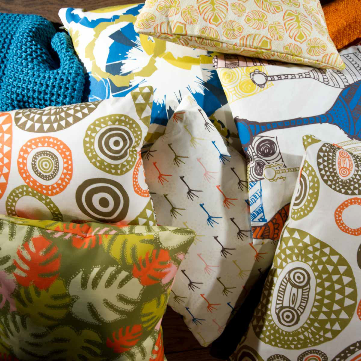
Design applications
Brand and logo design
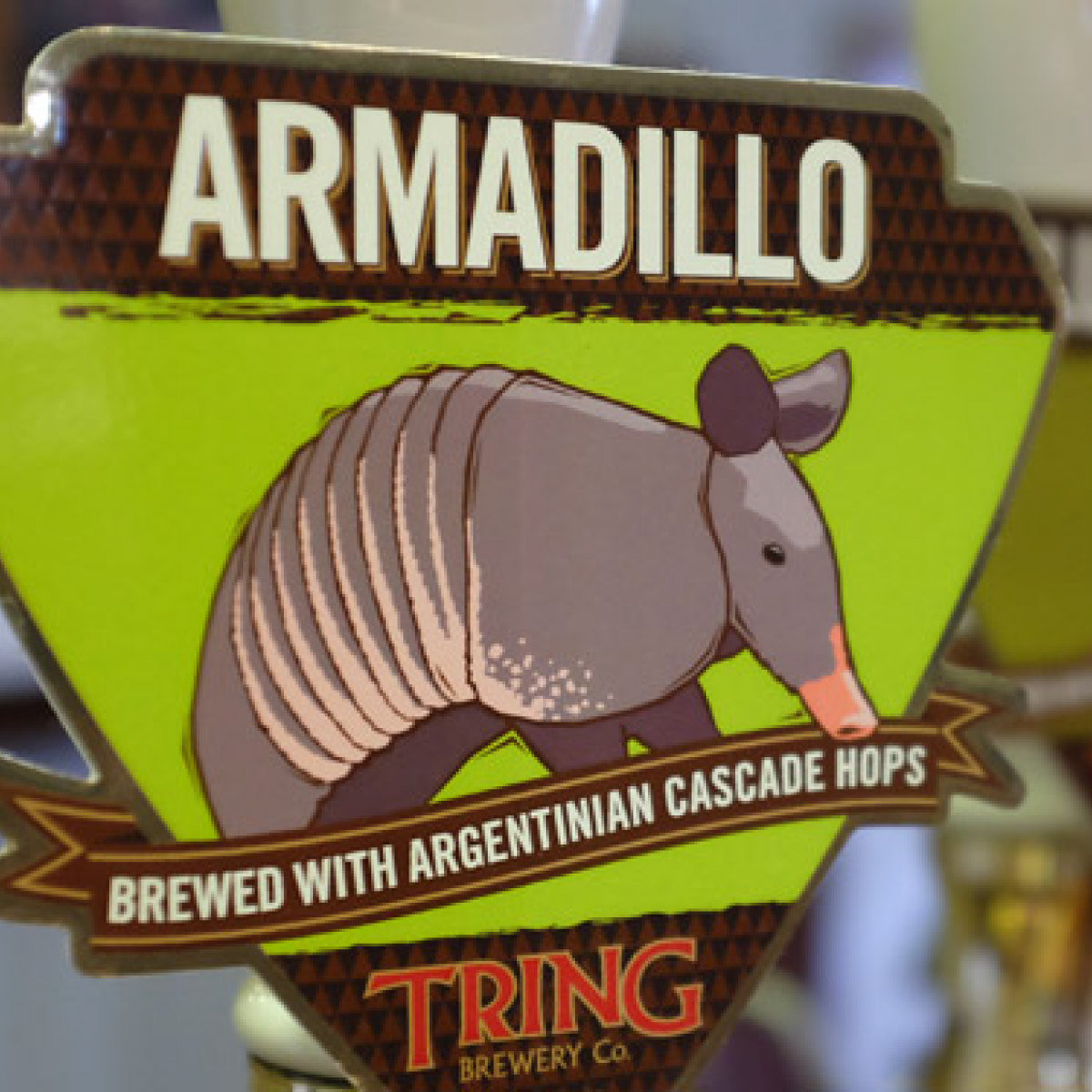
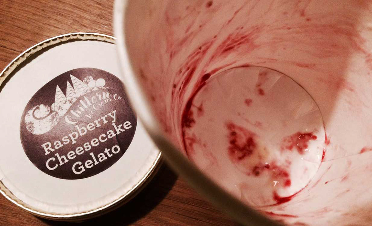
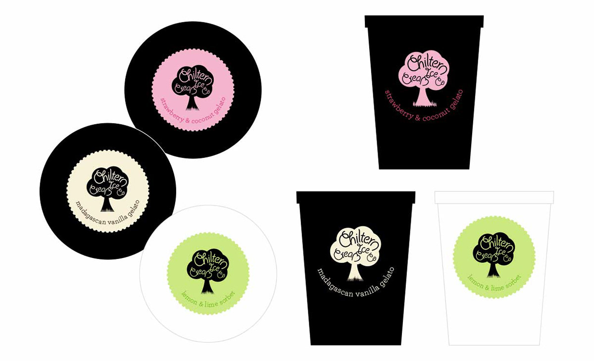
Label design
Brand and logo design
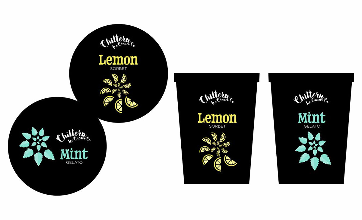
Label design