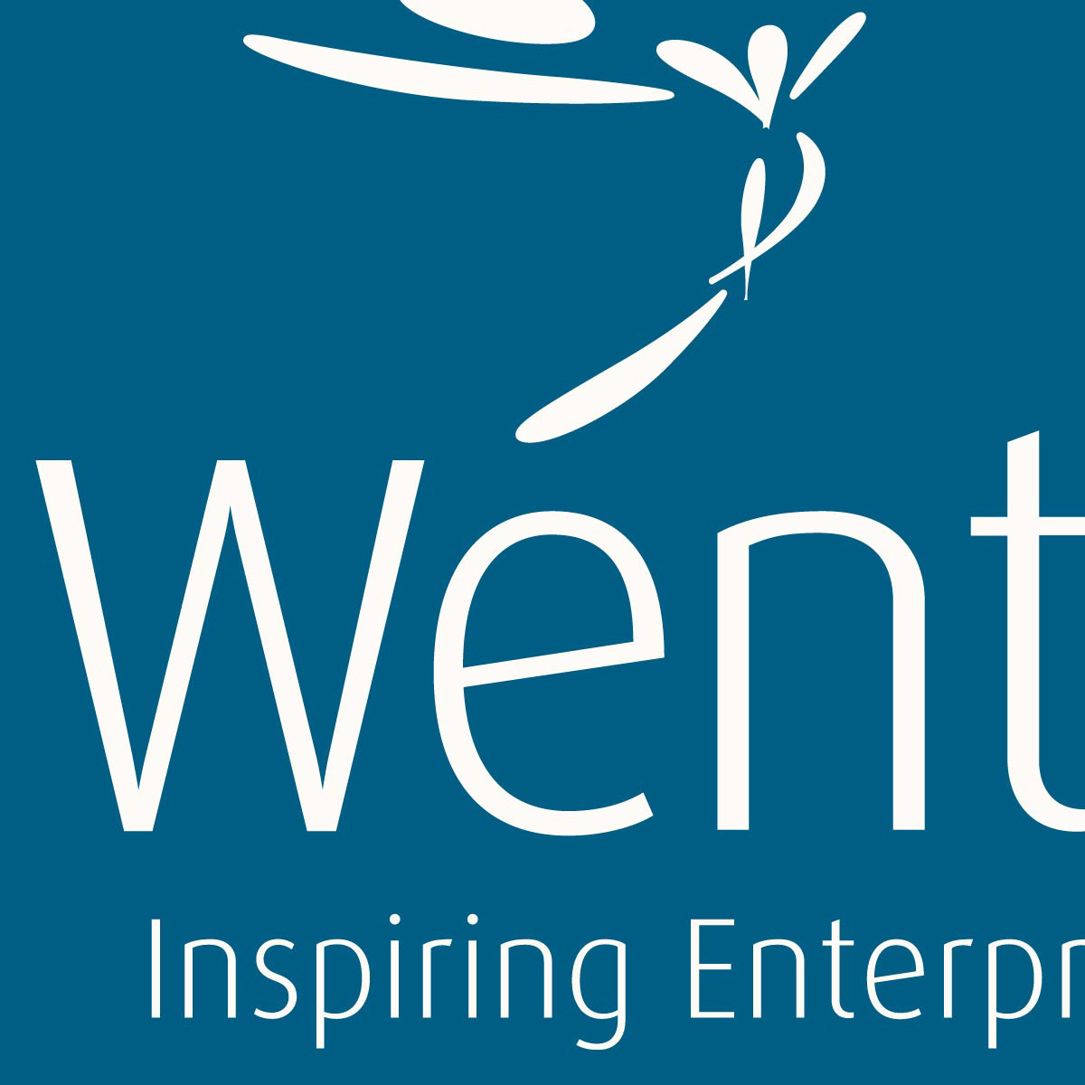
The National Enterprise Network (formerly the NFEA) asked us to create a new identity to reflect the new name and the changing business market that they work in.
The National Enterprise Network is the membership body for those committed to the support and development of enterprise.
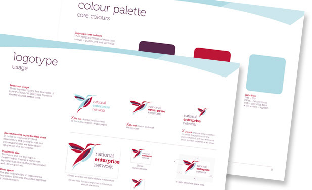
Using applied colour psychology, Group 3 colours were chosen as the palette to work within and the hummingbird icon was chosen as a symbol of optimism and accomplishing all that seems impossible.
Design applications
Brand and logo design
Brand guidelines
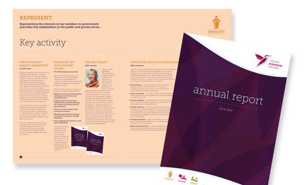
Literature
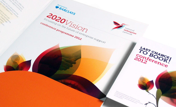
Conference printed materials
Conference AV materials
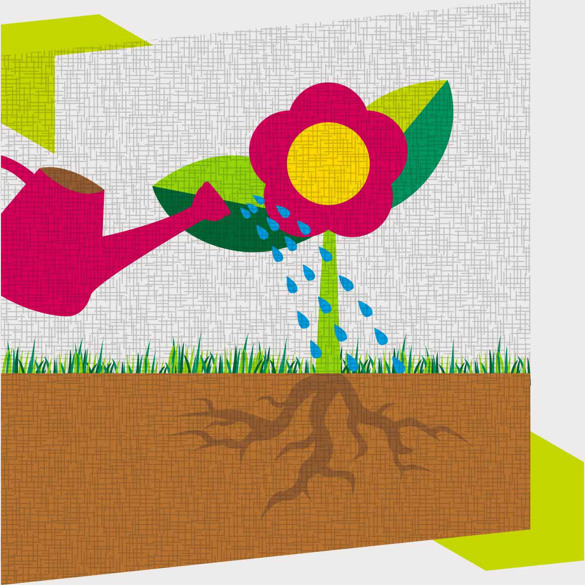
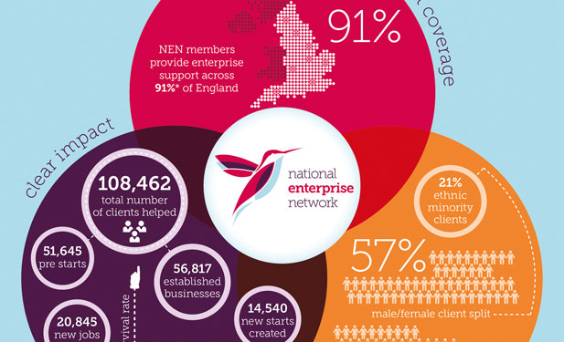
Infographics
Stationery
Brand and logo design
Brand guidelines
Literature
Conference printed materials
Conference AV materials
Infographics
Stationery
Testimonial
“The consideration KM Design gave to our requirements was of a very high standard. The design suggestions were well thought out, unique and highly effective.”
--Hayley Williams, Head of External Relations, NEN--
“The consideration KM Design gave to our requirements was of a very high standard. The design suggestions were well thought out, unique and highly effective.”
--Hayley Williams, Head of External Relations, NEN--